The screen layout
Every signed-in page in Aegis sits inside the same frame — sidebar on the left, top bar across the top, working area in the middle — so once you learn the frame, you can find anything.
This chapter is a tour of that frame. It uses the dashboard as the example screen, because that is where you land after signing in, but the sidebar and top bar are identical on every page. Learn them once and the rest of this guide can get straight to the task in hand.
Who uses it
Everyone sees the same frame, but not the same contents. A Viewer sees the same pages as a Contributor, but the buttons that create or change things are not rendered. A Contributor can create and edit records in most modules. A Manager adds approvals, board-level reporting and connector setup. An Admin adds user, role, licence and integration management. A group heading appears only when at least one item inside it is available to you, and the sidebar hides any module your organisation has not licensed or has not switched on — so a colleague's menu may be longer or shorter than yours. Roles at a glance sets out what each role can do.
What's on this screen
The screenshot below was captured as a Contributor on the
/dashboard route of a staging environment, so the figures in it are
test data rather than yours. The frame around those figures is the real thing.
Across the top is the top bar. On the left sits your
organisation's name (here staging, the staging tenant), then the
search box marked Search…. On the right is a row of account-wide
controls, in this order: the language switch (EN), a moon icon that
toggles light and dark appearance, a circled ? that opens the User
Guide at the chapter for the page you are on, the notifications bell with its
unread count (here 99+, how any count above 99 is shown), your
initials and name (Test Contributor 1), and Sign out.
On a narrow screen the name label and the word inside the search box drop away;
the controls themselves stay.
Down the left is the sidebar
(the column of module links). At the top is the Aegis mark, which
returns you to the dashboard from anywhere. Below it,
Dashboard sits on its own as a top-level item, then come the eleven
group headings in the order captured here: GOVERNANCE,
RISKS, COMPLIANCE, AUDIT,
DOCUMENTS, PRIVACY & WHISTLEBLOWING,
SECURITY INCIDENTS, ASSETS (CMDB), AI,
REPORTING and ADMINISTRATION, with thin dividers
separating the core groups from the supporting ones. Each heading carries a
chevron and starts collapsed, which is why the capture shows headings rather
than links. At the very bottom, below a rule, sit User Guide and
Help.
The rest of the screen is the working area. On the dashboard
that means the page title Dashboard and its one-line description, a
blue Getting Started banner showing setup progress (6/8 steps — 75%) with a chevron to collapse it and an × to dismiss it, then a
toolbar row holding What needs my attention? and
Ask AI on the left and Refresh on the right, a
Customize button beneath, and the widget grid itself. Every other
module reuses the same shape: a title, a toolbar, then the content — usually a
list or table, with a detail view when you open one record.
Bottom right, a round violet button floats above the page — the AI assistant, which stays in that corner wherever you go.
Read the working area at a glance
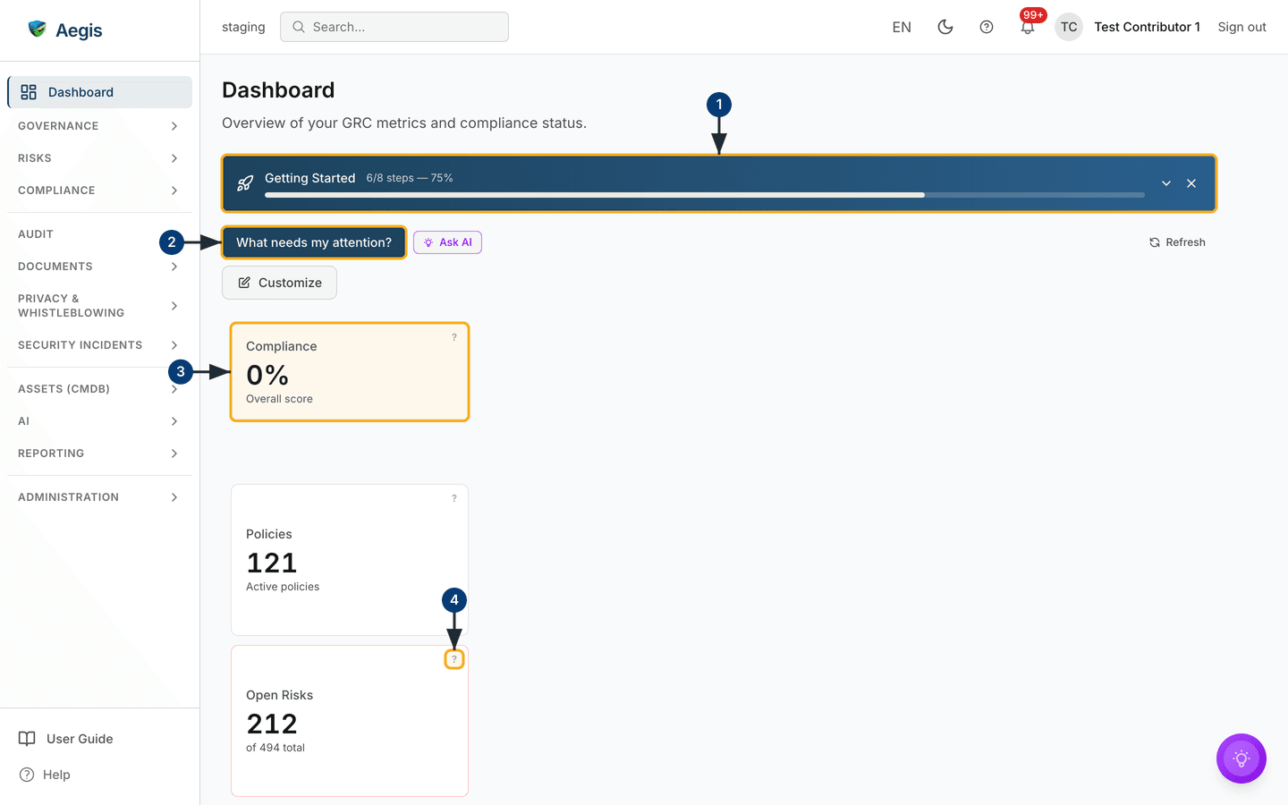
The numbered callouts on the figure below walk the top of the dashboard, from the banner down to the charts. The headline cards are also shortcuts: each one is a link into the module it summarises, so that row doubles as a way in.
-
The
Getting Startedbanner runs across the top while setup is unfinished — here6/8 steps — 75%. The chevron collapses it and the×dismisses it. -
Below it sits the toolbar.
What needs my attention?asks the AI for a briefing of what is pressing across your modules,Ask AIbeside it opens the assistant, andRefreshat the far right of the same row pulls new figures.Customizesits on the row beneath. -
The
Compliancecard opens the grid with your overall score across the frameworks you are tracking. It reads0%here because the staging tenant has not been assessed yet. Select the card to open the compliance area; the cards beside it behave the same way —Policies(120active),Open Risks(215of498),Vendors(169, of which82high-risk) and, on the second row,Pending Reviews(41). -
The small
?in the corner of a card — called out here onOpen Risks— asks the AI to explain that metric in plain words. Five cards carry it:Compliance,Policies,Open Risks,VendorsandPending Reviews. -
Framework Progress, on the right, lists the frameworks it has room for with their completion — five of them in this capture,BSI C5:2020at2%and the rest at0%or1%— and closes with a+25 moreline counting the frameworks it could not show. That line is a count, not a link. -
Compliance Trend, below the cards, plots the score over time. TheAll frameworksdropdown narrows the chart to a single framework.
One card in the grid is not a counter:
Vulnerability Intelligence shows the state of a connected
vulnerability feed. It reads Synced in the capture, with
32,488 CVEs tracked and 1,676 actively exploited,
updated three hours ago. It carries no ? explainer.
The capture comes from a staging environment where records have been loaded
but not yet assessed, so the compliance score and most framework bars read
0%. Your own figures move as you map controls, attach evidence
and complete reviews — a score in Aegis is a live reading of your records,
never a final mark.
Moving around with the sidebar
The sidebar is your main way between modules. Because groups start collapsed, reaching one takes an extra step the first time:
-
Select a group heading —
COMPLIANCE, for example. The chevron rotates and the group's links slide open beneath it. - Select the link you want. The page loads in the working area and the link stays highlighted, so you can see where you are.
- Select the heading again to collapse the group. Aegis remembers which groups you left open and restores them next time, in that browser.
Two more details are worth knowing. A link can carry a small count badge when
items are pending, capped at 99+. And the right-hand edge of the
sidebar is a drag handle: pull it left or right so long module names fit, or
focus it with the keyboard and use the arrow keys — the width is remembered in
that browser. Below about 1024 pixels the sidebar becomes a slide-out drawer,
opened by the button at the very top left.
The left menu at a glance lists every group and item, each linking to its own chapter — use it as the map when you know what you want but not where it lives.
Finding a record with search
Search saves you from remembering which module a record lives in. It covers policies, risks, vendors, evidence, incidents, procedures and connectors, and it indexes the pages themselves, so you can also use it to jump to a screen.
-
Select the
Search…box in the top bar. A search panel opens over the page with the cursor already in the field. -
Type at least two characters. Results appear as you type, grouped by what
they are, with a
Pagesgroup for destinations that match. -
Move through the results with the up and down arrow keys and open the
highlighted one with
Enter, or select it with the mouse.Esccloses the panel without opening anything.
The search box shows a ⌘K or Ctrl+K hint only when
that chord opens this search. Where the keyboard-shortcuts feature is
switched on, the chord opens the command palette instead and the hint is
hidden — which is why none appears in the capture above. Selecting the box
always works.
Keeping up with notifications
The bell collects the things waiting on you: an approval, a review falling due,
a record assigned to you, a status that has changed. Its badge counts unread
items, capped at
99+.
-
Select the bell. A panel drops down headed
Notifications, listing your ten most recent entries, each with what happened and when. With nothing waiting it readsNo notifications yet. -
Select a notification: it is marked as read, and where it points at a
record, that record opens. Or use
Mark all as readat the top of the panel to clear the badge in one action. -
Select
View all notificationsat the foot of the panel to open/notifications. That page adds aCategory:filter, anUnread onlytick box, tick boxes for marking several as read at once, a delete control on each row, paging, and aPreferenceslink for choosing what you are notified about. With nothing outstanding it readsNo notifications found, withYou're all caught up!beneath.
The AI assist
Three AI affordances live in this frame. All three only propose: a person reads the output and decides what to do with it. Nothing is written to a record unless you choose to save it — the attention briefing, for instance, offers a save action you have to select yourself.
-
What needs my attention?— on the dashboard toolbar. It writes a short briefing of what is pressing across your modules right now. -
The
?on theCompliance,Policies,Open Risks,VendorsandPending Reviewscards — explains that metric in plain words: what it counts and what moves it. -
Ask AIand the floating button — open the assistant to ask about the screen you are on or to draft text you then edit.
AI answers can be wrong, and each billable AI action draws on your organisation's credit allowance. The AI assistant and agents covers what is metered and how the assistant is governed.
Tips and limits
If a module is missing from your sidebar, it is either outside your organisation's licence tier or gated to a higher role. A Viewer sees the same pages as a Contributor but without the controls that create or change things. Ask an Admin if you think you should have access.
-
The dashboard refreshes itself about every five minutes, and
Refreshpulls new figures immediately. Other modules do not — reload the page if you are watching something change. -
Customizerearranges, resizes, adds and removes dashboard widgets; the layout is saved to your account, not your organisation's. The dashboard chapter walks that through. -
A card that says it is not configured is a prompt to connect a source, not a
fault.
Vulnerability IntelligencereadsSyncedin the capture because a feed is already connected there; on a new tenant it asks to be set up first. -
The
Getting Startedbanner disappears once every step is done, or when you dismiss it with the×. Dismissing hides it for you alone; the checklist stays at/getting-started. - Language, theme, sidebar width and open groups are all personal settings. Language and theme follow your account; sidebar width and group state are held in the browser you are using, so a different machine starts from the defaults.
Where this connects
If you have not signed in yet, start at Signing in. Next, work through First-time setup so Aegis knows which rules apply to your organisation, then read the dashboard chapter for what each widget shows and how to rearrange them. The left menu at a glance maps every module to its chapter, Roles at a glance explains why your menu and buttons look the way they do, and Getting help covers what to do when something is missing or stuck.