Analytics and benchmarking
Two read-only views: Analytics charts your own compliance, risk and policy figures over a window you choose and can narrate them with AI, and Benchmarking sets those figures beside anonymised peers.
These two pages answer different questions about the same programme. Analytics looks inward — how are our own numbers moving, and why? Benchmarking looks outward — how do we compare with organisations like ours? Both gather figures that already exist elsewhere in Aegis and present them as cards and charts. Neither lets you edit a record; to change a figure you go to the module it comes from.
Who uses it
Analytics opens to
Contributor and above; a
Viewer who types the address is
sent to the access-denied page. Benchmarking opens to every role, Viewer
included, but it is a licensed feature: when Peer Benchmarking is
not on your licence the page shows a short notice instead of the cards. Some
controls inside Analytics are gated by permission rather than by role name — the
AI buttons and the two AI panels below the header need the report-read
permission, and Export Dashboard needs the report-export
permission, which a Contributor does not hold. That is why the capture below
shows no export button, while a
Manager or
Admin sees one.
What's on this screen
/analytics sits under the Reporting group in the left
menu and opens as one scrolling page. The header carries the title
Analytics with the line "Advanced reporting and trend analysis",
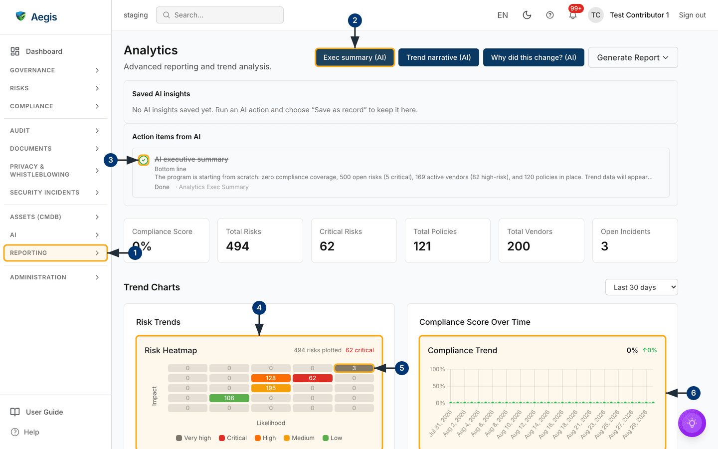
and on the right a row of buttons: Exec summary (AI),
Trend narrative (AI), Why did this change? (AI) and
Generate Report.
Below the header sit two panels holding the output of past AI runs.
Saved AI insights lists insights you chose to keep; in the captured
tenant nothing has been kept yet, so it reads "No AI insights saved yet. Run an
AI action and choose 'Save as record' to keep it here." Under it,
Action items from AI lists the follow-ups those runs produced — the
capture holds one, "AI executive summary", showing the status
In progress and the source Analytics Exec Summary. The
small circle at the left of a row is its status control.
Next comes a row of six figures: Compliance Score,
Total Risks, Critical Risks,
Total Policies, Total Vendors and
Open Incidents — in the capture 0%, 498, 62, 120, 200 and 3. Then
the Trend Charts heading with a date-range list on its right (the
capture shows Last 30 days) and the charts:
Risk Trends holding the
risk heatmap (impact against likelihood, "498
risks plotted, 62 critical"), Compliance Score Over Time holding
the trend line, and below the fold Policy Status Distribution,
Vendor Risk Overview, Incident Trends and
Evidence & GDPR Summary.
Open Analytics and read the figures
-
Open the
Reportinggroup in the left menu and chooseAnalytics. The page loads the six figure cards first, then the charts underneath. -
Select
Exec summary (AI)in the header. A window opens over the page explaining what the summary will cover, with aWrite summarybutton — nothing is generated until you press it. -
In
Action items from AI, select the circle at the left of a row to move it on:OpenbecomesIn progress, thenDone, then back toOpen. The label under the title changes as soon as it saves. -
Read the
Risk HeatmapunderTrend Charts. The grid runs impact against likelihood, but on this page it is filled by severity band (the level a risk's impact × likelihood score falls into): each band's total sits in one representative cell, coloured to match the legend below the grid. So a shaded cell is a band's count, not a count of risks at exactly those coordinates. The figures in the corner name the population — in the capture, "498 risks plotted, 62 critical". Risks with no score are not plotted. -
Select a shaded cell. Cells holding at least one risk are links — Aegis
opens the
risk register filtered to that cell's likelihood
and impact coordinates and to open statuses (
OpenandInProgress). Because the cell counts a whole severity band and the link filters on one pair of coordinates, the register will usually list fewer rows than the number in the cell. Cells reading0are not clickable. -
Read
Compliance Trendon the right for the same window. The percentage and change indicator sit above the line; with nothing to plot the panel saysNo compliance data availablerather than drawing a flat line.
Every chart needs records inside the chosen window. A new tenant, or one
with no frameworks activated, shows sparse charts — the compliance panel
reads
No compliance data available, and
Incident Trends can read Coming soon where that
breakdown is still being built out. That is the page being honest, not an
error. Widen the range, or add the data in the source module.
Change the window
-
Open the date-range list beside the
Trend Chartsheading and pickLast 7 days,Last 30 days,Last 90 daysorLast 12 months. The charts redraw against the new window straight away. - Note what does not move: the six figure cards at the top are a snapshot of today and ignore the range. Only the trend charts respond to it.
- Set the range before running an AI action: the AI reads the window you have chosen, and changing it afterwards does not rewrite an answer already on screen.
Run an AI read-out
Three AI actions sit in the header, all working over the selected window and all
read-only.
Exec summary (AI) writes a board-ready summary — bottom line, what
is working, what needs attention, a recommendation.
Trend narrative (AI) describes how the compliance, risk and vendor
figures moved, leading with what is deteriorating or standing still.
Why did this change? (AI) drills into one metric you pick: overall
compliance score, total open risks, critical risks, average risk score, active
vendors or critical-risk vendors.
-
Choose your window, then select one of the three AI buttons. A window opens
describing what the action does — and, for
Why did this change?, aMetric to explainlist. Pick the metric before you start. -
Select the start button (
Write summary,Write narrativeorExplain change). Aegis works through named steps — reading the posture, classifying the direction of travel, then writing — and the text streams in as it is produced. -
Read the answer against the figures it was grounded in. Where the action
reports them, a
Verified figuresblock and aConfidenceindicator sit with the text; check the wording against your own numbers before using it. -
Decide what to keep:
Copyto the clipboard,Export DOCXorExport PDFto download,Save as recordto keep it inSaved AI insightson this page,Create action itemto add a row toAction items from AI, or run it again from the button that names the action —Rewrite summary,Rewrite narrativeorExplain again.
Generate a report or export the dashboard
-
Select
Generate Reportat the top right. A short menu opens beneath it withExecutive Summary,Compliance Status,Risk OverviewandView All Reports. -
Pick a template and Aegis opens the report builder already set to it; pick
View All Reportsfor the Reports list instead. Nothing on the Analytics page changes either way. -
If your role holds the report-export permission, use
Export Dashboardbeside it:Export as PDFgives a branded document,Export as CSVthe flat figures, both for the selected window. If an export fails, a message says so and nothing is downloaded.
What's on the benchmarking screen
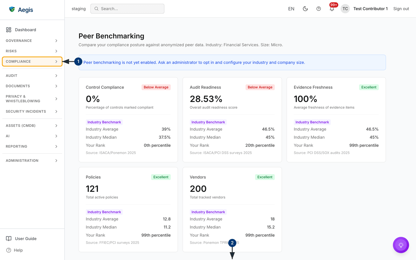
/benchmarking sits under the Compliance group. It
opens with the title Peer Benchmarking and a line naming the
segment you are compared against — in the capture, "Industry: Financial
Services. Size: Micro." Below it, a blue notice appears while the tenant has not
opted in: an administrator sees a link to Settings → Benchmarking,
everyone else is told to ask an administrator. Then five metric cards —
Control Compliance, Audit Readiness,
Evidence Freshness, Policies and
Vendors — each with a tier badge beside its title, your value, and
a comparison block underneath.
Peer Comparison & Maturity follows below them.
-
Open the
Compliancegroup in the left menu and chooseBenchmarking. Read the line under the title first — it tells you which industry and size band the figures are matched to. -
Scroll past the five cards to
Peer Comparison & Maturity, below the bottom of the capture. It holds a maturity score, a radar chart of your values against the peer average, and a table of five dimensions — policy coverage, risk maturity, incident response, vendor management, evidence freshness — each with your value, the peer average, your percentile and the trend. The whole section only appears once comparison data has loaded, and the table saysNo comparison data available.when there is nothing to compare.
Each card carries the same five parts:
| Part of the card | What it means |
|---|---|
| Your value | Your own figure, with a line saying how it is counted. |
| Tier badge |
A banding of your percentile: Excellent from the 75th,
Good from the 50th, Average from the 25th,
otherwise Below Average.
|
| Source label |
Industry Benchmark means a published baseline. Where
enough peers have opted in, the rows read
Peer Average and Peer Median
instead, with a peer count.
|
| Average and median | The middle of the comparison set; one outlier moves the average. |
Your Rank and source line |
Your percentile within that set, and the study the baseline came from — the capture cites ISACA/Ponemon 2025 and PCI DSS/SOX audits 2025, among others. |
In the capture, Evidence Freshness shows 100% with an
Excellent badge at the 99th percentile, while
Control Compliance shows 0% with Below Average at
the 0th. The badge only bands your percentile within the comparison set, and
a thin or baseline-driven set can push a figure into a flattering or an
unflattering band. Read the badge with your own value, the median and the
source line before drawing any conclusion.
The AI assist
The three AI actions write about figures Aegis has already calculated; they do not calculate them. Direction of travel — improving, deteriorating or standing still — is classified by Aegis from the stored snapshots, and the AI narrates that classification. Every run is started by a person, over a window that person chose, and the result stays on screen until someone copies, exports, saves or discards it. Saving an insight or creating an action item are deliberate choices; the AI never edits a record, changes a status or files anything by itself. Each billable AI action draws one credit from your tenant's monthly allowance.
Tips and limits
- A compliance score is a guide, not a grade: a high number means few known gaps today, not that the work is done.
- The six figure cards ignore the date range. If a chart looks empty, widen the range before assuming something is wrong.
- Treat an AI summary as a first draft. Compare it with the figures on the page, and keep it only once you agree with it.
- A true peer comparison needs at least five opted-in organisations in your segment. Below that, a card falls back to a labelled industry baseline — read that as "not enough comparison yet" rather than a fault in your own figure.
-
Sharing your own anonymised metrics is opt-in, stays under
Settings → Benchmarking, and never names an individual organisation.
Where this connects
The figures come from Compliance frameworks, Risks, Policies, Vendors, Incidents and Evidence. Follow-ups collect in Action items; documents are built in Reports and Board reports; the peer opt-in lives in Settings. Roles are set out in What each role can do.